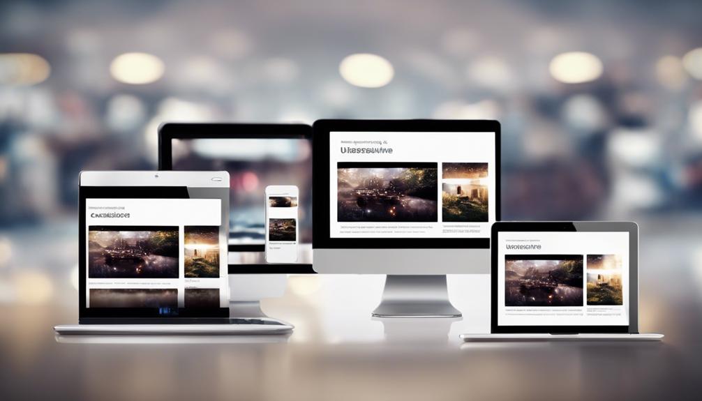
When it comes to ensuring your website performs optimally on mobile devices, there are key factors at play that determine its responsiveness. From the way your content is sized and structured to the utilization of breakpoints and viewport settings, each element contributes to a seamless user experience.
But have you ever considered how the type of images you use or the way you manage content visibility could impact your site’s mobile performance? Understanding these nuances can make all the difference in how your website translates across various screens.
Importance of Mobile Responsiveness

Mobile responsiveness isn’t just a trend but a necessity in today’s digital landscape, impacting user experience and search engine rankings significantly. A mobile-responsive site adapts its layout and design to fit the screen size of the device being used, ensuring optimal viewing and interaction. This responsiveness is crucial as mobile devices now represent more than half of global web traffic. With Google giving priority to mobile-friendly websites in search results, having a responsive design is essential for enhancing user experience and improving visibility.
When your site isn’t mobile-responsive, it can lead to a poor user experience, resulting in a high bounce rate and lower conversion rates. Research indicates that 57% of users are unlikely to recommend a business with a poorly designed mobile site. By embracing mobile responsiveness, you guarantee that your website is accessible and user-friendly across various devices and screen sizes, ultimately improving engagement and driving better results.
Impact of Screen Resolution
Considering the pivotal role of screen resolution in determining the optimal display of content on mobile devices, it is essential to understand its impact on user experience and design considerations. Responsive design utilizes CSS media queries and the viewport meta tag to adjust layout changes based on different screen resolutions, ensuring a consistent experience across devices. When designing for smaller screens, like those of mobile devices, flexible grids are essential to allow content to adapt seamlessly. On larger screens, the challenge lies in maintaining image clarity and text legibility without sacrificing layout integrity. Below is a table highlighting the key impacts of screen resolution on responsive design:
| Aspect | Impact | Consideration |
|---|---|---|
| Image Clarity | Resolution affects clarity and detail | Optimize images for various resolutions |
| Layout Changes | Screen size influences layout responsiveness | Use CSS media queries for adaptation |
| Text Legibility | Font size and spacing may need adjustments | Ensure text remains readable |
Understanding these factors will help you create a mobile-responsive design that caters to a wide range of screen resolutions.
Role of Flexible Images

To achieve optimal responsiveness on varying screen sizes, understanding the role of flexible images in responsive web design is crucial. Flexible images are integral to Responsive Web Design as they adapt seamlessly to different screen sizes. By utilizing techniques like CSS’s max-width property, images can scale proportionately without losing quality or distorting the visual content. This ensures an enhanced user experience by optimizing image display on mobile devices.
Properly resized images not only improve user experience but also contribute to overall site performance and faster loading times across various devices. Incorporating fluid images in CSS helps maintain design integrity and visual appeal, regardless of the screen resolutions.
Therefore, implementing flexible images is essential for ensuring that your website remains visually appealing, loads quickly, and provides an excellent user experience on all devices.
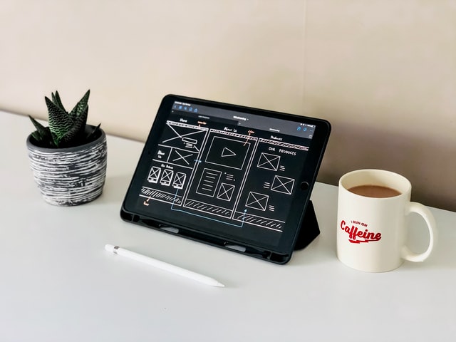
Utilizing Custom Layout Structure
With a focus on achieving optimal responsiveness for your site, custom layout structures in responsive design offer tailored solutions to address unique design requirements effectively.
Designers can create custom breakpoints and element arrangements to ensure that your site adapts seamlessly to specific devices and screen sizes.
By customizing layout structures, you can optimize the user experience by tailoring the design elements for different devices, leading to a more engaging experience for your visitors.
Custom layouts play a crucial role in addressing specific design challenges and ensuring that your site looks and functions flawlessly across various devices.
Implementing custom layout structures requires meticulous planning and thorough testing to guarantee consistency and cohesiveness in design.
Implementing Media Queries

Implementing media queries in CSS allows for precise control over element styles based on device characteristics such as screen width, height, and orientation. By utilizing min-width, max-width, and device-specific queries, you can tailor your styles to create responsive designs that seamlessly adjust to different screen sizes.
This flexibility is crucial for optimizing layouts across mobile, tablet, and desktop screens, ensuring a consistent user experience. Media queries play a fundamental role in adjusting styles to meet the specific requirements of each device, ultimately enhancing the overall responsiveness of your website.
Through strategic implementation of media queries, you can fine-tune the appearance and functionality of your site, making it visually appealing and user-friendly on a variety of devices. Embracing media queries is key to achieving a design that not only looks great but also performs optimally across diverse screen resolutions.
Managing Content Visibility
Prioritize essential information for smaller screens by managing content visibility effectively in mobile responsiveness. When designing for mobile devices, it is crucial to ensure that users can easily access the most important information without being overwhelmed by unnecessary content. By hiding non-essential elements, such as large images or excessive text, you can streamline the user experience and enhance the visibility of critical details like navigation menus and calls-to-action. Testing the visibility of content across various screen sizes is essential to optimize mobile responsiveness and guarantee that users can interact seamlessly with your site on any device. Clear navigation paths and prominent calls-to-action further contribute to improved content visibility, making it easier for users to find what they need efficiently. Remember, a well-organized and prioritized layout leads to a better user experience on small screens.
| Content Visibility | Small Screens | Essential Information | Hiding Content | Mobile Design |
|---|---|---|---|---|
| User Experience | Navigation | Calls-to-Action | Testing | Optimization |
Comparing Touchscreens and Cursors

To optimize user interaction on different devices, understanding the distinct characteristics of touchscreens and cursors is crucial for effective design implementation. When comparing touchscreens and cursor-based interactions, there are key differences to consider:
- Touchscreens require larger, finger-friendly elements to ensure easy navigation, whereas cursor-based interactions allow for more precise clicks.
- Touchscreens rely on taps and gestures for user input, prioritizing user-friendly design with intuitive actions like swiping and pinching.
- Cursor-based interactions offer the advantage of hover effects and right-click options, which may not always translate seamlessly to touchscreens.
Both touchscreens and cursor-based interactions necessitate specific design considerations to optimize user experience based on the device used. By incorporating these differences into your design strategy, you can create a more responsive and user-friendly interface tailored to the specific needs of your audience.
Conclusion
In conclusion, the mobile responsiveness of your site is crucial for providing a seamless user experience across different devices. Did you know that 57% of users say they won’t recommend a business with a poorly designed mobile site?
By implementing responsive web design principles, optimizing for various screen resolutions, and utilizing media queries, you can ensure that your site is accessible and user-friendly on any device.
Don’t overlook the importance of mobile responsiveness in today’s digital landscape.