If you’re like most business owners, you want your website to look great on any device. Responsive web design is the best way to make that happen.
In this blog post, we’ll discuss responsive web design and how it works. We’ll also show you some examples of responsive websites, so you can see for yourself how well it works.
Responsive web design is quickly becoming the standard for website design, so don’t miss out!
What Is Responsive Web Design?
Responsive web design is a way to make sure that your website looks good and works well on any type of screen. That means that it will be easy to read and navigate whether someone is looking at your website on a desktop computer or a mobile phone.
There are a few key elements that are important to responsive design:
- Fluid grids: A fluid grid is the foundation of responsive design. It uses percentages instead of fixed pixels to define the size of each element on the page. This allows the layout to adapt to any screen size.
- Responsive images and media: Images and videos should also be sized using percentages to remain visible within the flexible grid. In addition, media Queries can be used to determine the width and height of an element and then adjust the image size accordingly.
- Flexible containers: a flex container uses the browser window size to determine how much space each element should take up. This ensures that all elements on the page are visible and easy to read, regardless of browser size.
- Media Queries: Media queries are a powerful tool that allows designers to tailor the user experience for different devices. By using media queries, designers can offer different stylesheets for different devices, making it possible to create truly responsive designs.
Responsive layout design is a great solution for those who want their site to work well on all screen resolutions. With fluid grids, flexible images, and media queries, a responsive design makes it possible to create rich user experiences that work well on any screen size.
What is a responsive website?
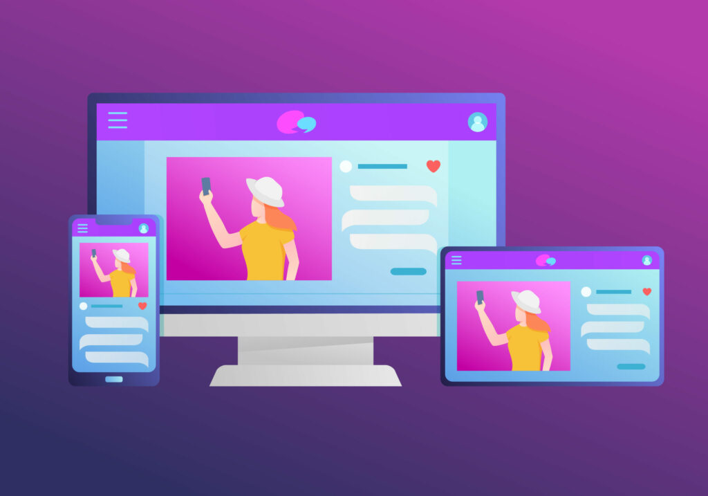
A responsive website is a site that automatically adjusts to fit the screen size of the device it is being viewed on.
This means that the content will always be easy to read and navigate, whether you are looking at a site on a phone, tablet, or laptop.
Creating a separate mobile version of a website was common practice in the past. However, this meant that users would often have to zoom in and out to view different parts of the page, which could be frustrating.
Responsive websites solve this problem by automatically re-arranging content to make it easy to view no matter your device.
As more and more people use their phones and tablets as their primary way of accessing the internet, having a responsive website has become increasingly important.
How to check if your website is responsive
There are a few different ways to check if your website is responsive. One way is to simply resize your browser window and see if the content on the page adjusts accordingly.
Another way is to use a responsive design test tool like Google’s Mobile-Friendly Test. Simply enter your URL into the tool, and it will tell you whether or not your site is responsive.
Finally, you can view your site on a mobile browser. If you can, try using a range of devices (phones, tablets, etc.) to see how it looks and functions. If it looks and works well on all devices, then you can be confident that your site is responsive.
What is a responsive website design?
Responsive website design is a website that is designed with a mobile-first approach. Usually, the design will use a multiple-column layout with a gutter between each column. The site will have a flexible layout that is easy to read and navigate on any device.
In addition, the site will use media queries to determine the width and height of an element and then adjust the size accordingly.
This allows the site to be truly responsive and offer a rich user experience no matter what device it is viewed.
Responsive web design is essential for both web designers and business owners.
In today’s digital world, businesses need to have a website that is responsive to the needs of their customers.
With more and more smartphone users s to access the internet, it is essential that businesses have a website that is easy to use on all handheld devices.
Responsive web design ensures that a website looks and works great on all screen widths.
This is important for both web designers and business owners because it provides a better mobile user experience and helps to improve conversion rates.
In addition, responsive web design is also important for search engine optimization (SEO) because it can help to improve a website’s ranking in search results.
As a result, responsive web design is essential for businesses that want to succeed in the digital world.
How to fix a non-responsive website
If your website doesn’t look on all types of devices, there are a few ways to fix that.
One way is to use a responsive design template. This will ensure that your website looks and works great on all popular device resolutions.
Another way is to hire a freelancer to help you make your website responsive.
You can add CSS styles to a grid layout and other workarounds. However, this may take some time and effort to do correctly.
Lastly, you can do a website redesign. This will allow you to improve your website’s design and ensure it is responsive.
No matter what method you choose, making your website responsive is essential for businesses in today’s digital world.
If you need help with your website redesign, contact us
Webfactory Media is a web design & development agency based out of Carlisle, Pa. That specializes in responsive web design, eCommerce development, and digital marketing.
We can help you with your website redesign and ensure that your site is responsive to your customers’ needs.
Contact us today to learn more about how we can help you succeed in the digital world.
Conclusion
Responsive web design is an important part of any website’s foundation and should be one of the first things you consider when starting a new project.
Not only will it make your website look great on all devices, but it can also help improve your SEO ranking.
If you need help getting started with responsive design or want to upgrade your current site, contact us for a free website review.
We would love to work with you and make your website look amazing on any device!