A professional website is the first impression that people have of your business. Combining color, text, and images can make it feel more professional, cluttered, and unprofessional. This article will discuss web design tips to create a professional-looking site that also functions well for visitors to use.
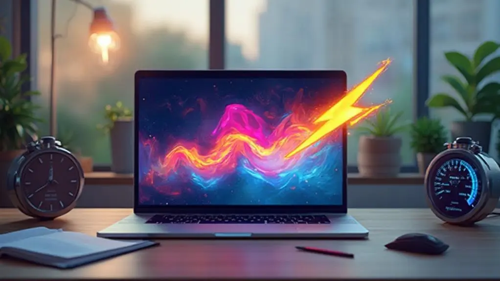
Make Site Speed a Priority
Google says that people expect a website to load within three seconds. If it takes longer, they abandon the site and go elsewhere. To ensure that your pages are loading fast enough, you have minimized any extraneous content such as animated images or page frames with excessive ads.
Focus Above the Fold
A website’s content must be above the fold, which is to say, in the viewable area without scrolling.
If your content is above the fold, it will be more likely to get noticed by visitors right when they land on your site.
You can create a hero section at the top of each page with engaging text that draws people in.
You may also want to consider implementing pull-down menus if you have too many items upfront or as an option for some sections of your website.
Utilize Hick’s Law
Hick’s Law states that too many choices can impact a person’s decision time.
Thus, you should limit the number of options available to visitors on your site by ensuring not all pages have links right at the top or in pull-down menus instead of showing them one page at a time, with a single option to click.
Keep it Simple
To help visitors use your site more efficiently, you need to know how many links and options you are giving them to choose from.
Do not overwhelm them with too many choices, or they will abandon the site and go elsewhere.
Avoid Carousels, Sliders, Tabs, and Accordions
Carousels, sliders, tabs, and accordions can make it difficult for your visitors to find what they are looking for and frustrate them by making them feel like they have to search around a lot to find something.
You should avoid including these elements in design unless you have a good reason to do so. Consider the following before you implement any of these features:
1) Is this element providing an important function?
2) Is this element easy to use?
3) Is this element worth the confusion likely to be caused by its use?
4) Would this element survive contact with an average user without causing major usability problems?
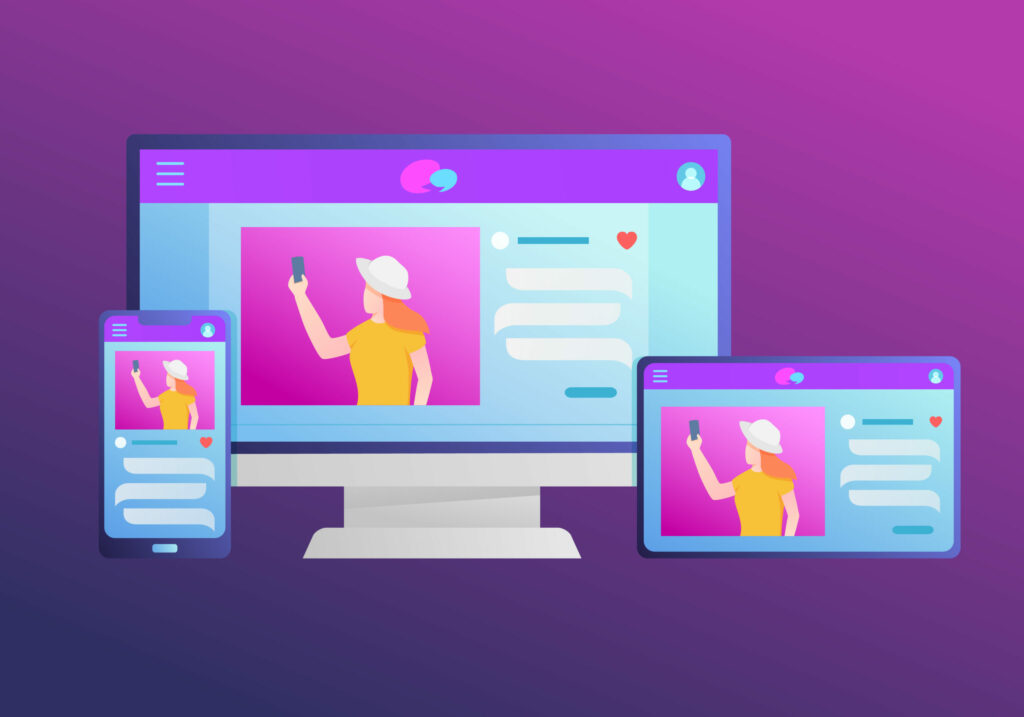
Mobile Responsive Design
When creating your site, you must consider mobile design because it can be much more difficult for visitors to navigate a site on their devices than on their computers.
Use Visual Cues to Direct Attention
One essential web design tip is to direct attention to important parts of your website by utilizing visual cues.
Help visitors find what they need more efficiently and avoid clicking on irrelevant content.
You can do this by making any call to action stand out against the rest of the page,
Keep it Engaging
If you want a professional-looking website, you must invest in your design and keep it engaging for visitors.
The tone and style of your website should be consistent and not too light or heavy on certain pages.
You can accomplish this by ensuring that all of your text is formatted correctly, keeping colors complementary to one another.
Avoid using cheesy stock photos in your web design
One way to make your website more professional-looking is to avoid using stock photos on your site. Instead, try to use images relevant to the content on the page, or be sure to give attribution for any images that are not yours (e.g., by including a caption).
Use High-quality media
Another way to make your website look more professional is by using high-quality media.
Use photos of people, places, or things related to the content on the page.
You can also use illustrations or video that is relevant to your topic.
Show People faces
One of the most important considerations regarding web design is how you will use images.
After all, a website is ultimately just a collection of visual elements, so the images you choose can make or break your site.
One image type often used on websites is photos of people’s faces. And for a good reason, studies have shown that incorporating faces into your web design can positively impact users.
Faces help humanize your site and make it feel more welcoming and approachable. In addition, they can also help to build trust and credibility with your audience.
So if you’re looking for ways to improve your web design, consider adding some faces.
Use a Clear, Concise Message for Your Website’s Headline
One of the most crucial web design tips you should follow is to use clear messages in your headlines. Users will know what they are going to get from reading on.
You should be able to summarize the information at the top of your page in a clear, concise headline and then follow up with more details if the visitor wants to continue reading.
Use Social Proof
If you want to make your website more engaging, adding social proof can be a good way of doing that.
This social proof includes using reviews on your site or testimonials from customers. Visitors will know they are in the right place, and it is worth their time investing in what you have for them.
Be Consistent With Colors, Fonts, And Spacing
For your web design to look professional, it has to be consistent.
You should have the same fonts and spacing throughout all pages of your website and similar colors.
If you are going with a specific tone on one page, then using contrasting tones on another could make the site seem more cluttered or unprofessional.
Use a lot of white space in your design.
In addition to using consistent colors, fonts, and spacing throughout your site, you also need white space.
This technique will make the page look more spacious and easy to read. It will help keep viewers from scrolling back up or down when reading through content on one particular web page.
Use Strategic Color Contrasts
Another web design tip you should follow is to use strategic color contrasts.
If you are using a lot of different colors on your site, then it’s best not to have too many similar shades.
Make sure they contrast with each other well enough so that people can differentiate between them without any problems.
For example, if you have a primary color like red, it would be best to use an accent color like blue.
Use Images That are Relevant
If you want your website design to look more professional and engaging, make sure the images on each page relate to the content.
Try to help readers better understand your offering, which will keep them from getting distracted by unimportant details.
Implement calls-to-action
Another web design tip you can follow is to use calls-to-action or CTAs.
You should have a call to action on all pages of your website and make it clear what the reader needs to do for them to move through the content at an appropriate pace.
If someone lands on your page but does not know what to do next, they will get frustrated and leave your site.
Conclusion
The tips in this article should help you make your website more professional and appealing to readers. Remember that every web design needs to be consistent with color, fonts, spacing, images, CTAs, and a clear message for the homepage, so people know what they are getting when they arrive at your site. The key is not overdoing one.